
Manually creating reports is a significant drain on your most valuable resource: time. Whether you're a finance team pulling together weekly P&L statements, an operations manager generating project status updates from Airtable, or an HR professional creating onboarding documents, the process is often repetitive, tedious, and prone to human error. Every hour spent copying and pasting data, formatting PDFs, or chasing down metrics is an hour not spent on strategic analysis and decision-making. To truly understand how automation can free up valuable time, consider how it applies to broader administrative tasks. This is where dedicated report automation tools become essential, transforming static data sources into dynamic, presentation-ready documents on autopilot.
This guide moves beyond generic feature lists to provide a detailed comparison of the top platforms available today. We’ll dive into practical use cases, implementation considerations, and honest limitations for each tool. You will find the ideal solution whether you need to generate invoices from Stripe data, create customized client reports from a CRM, or automate compliance paperwork using no-code platforms like Zapier and Glide. For each option, we provide screenshots and direct links to help you evaluate which platform best fits your specific workflow, data sources, and budget, empowering you to eliminate manual report generation for good.
1. DocsAutomator
Best for No-Code Document Generation from Existing Data Sources
DocsAutomator stands out as a premier choice among report automation tools, particularly for businesses embedded in ecosystems like Airtable, Glide, SmartSuite, Google Sheets, and Zapier. Its core strength lies in its intuitive, no-code approach. Instead of forcing users to learn a proprietary editor, it leverages the familiar interface of Google Docs for template creation, significantly lowering the barrier to entry.
This design philosophy allows teams to quickly automate the creation of complex, data-driven documents. You can transform raw data from your preferred apps into polished Google Docs or PDFs, complete with dynamic images, conditional formatting, and repeating line items for tables or lists. The entire process, from data mapping to final output, is designed for speed and simplicity, making it a highly efficient solution.
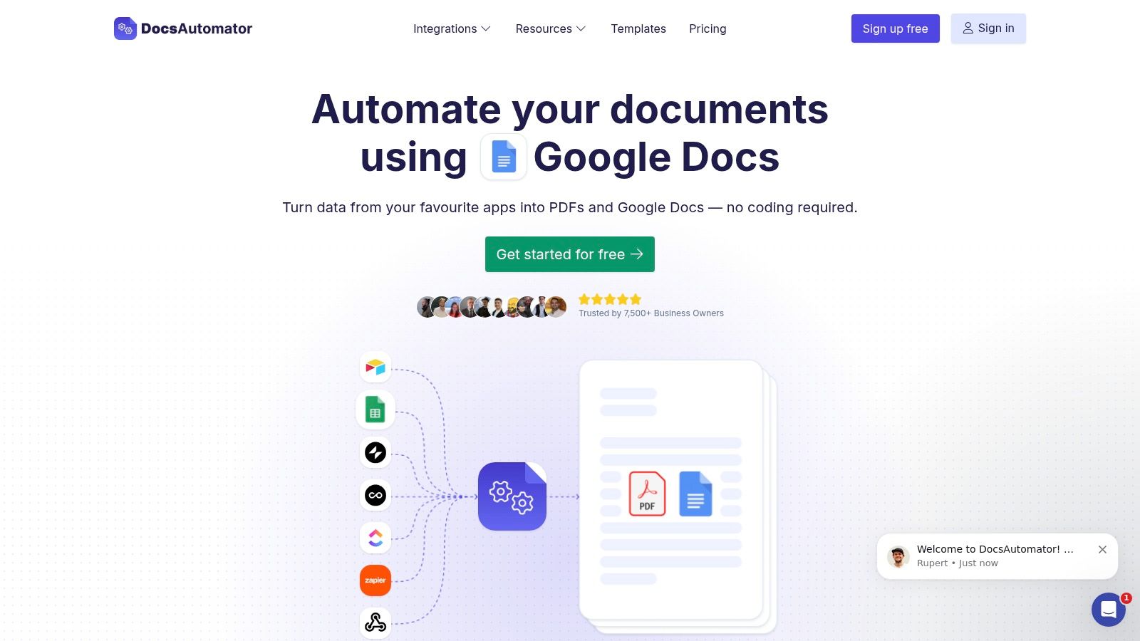
Key Features & Use Cases
DocsAutomator excels by combining powerful automation with user-friendly design. The platform’s AI-assisted data mapping suggests connections between your data source and template placeholders, accelerating setup. Its unlimited preview feature is a major advantage, allowing you to perfect documents without consuming your monthly quota.
- Finance: Automatically generate monthly financial summaries or detailed client invoices from an Airtable base containing transaction data.
- Project Management: Create weekly project status reports in PDF format by connecting DocsAutomator to a ClickUp project board via Zapier, pulling in task updates, timelines, and team member contributions.
- HR & Operations: When a new user signs up in a Glide app, trigger a workflow that generates a personalized welcome packet and training certificate.
- No-Code Apps: Generate custom proposals directly from a Noloco or SmartSuite app, populating client details and project scope automatically.
The platform handles the full document lifecycle. You can configure workflows to automatically email the generated PDF, save it to a specific Google Drive folder, or even merge it with existing PDF files. This end-to-end capability makes it one of the most comprehensive report automation tools for small to medium-sized businesses. For a deeper dive into its capabilities, you can explore how to automate document generation with DocsAutomator.
Pricing & Onboarding
DocsAutomator offers a compelling entry point with a generous free plan that includes 20 document generations per month. This allows businesses to thoroughly test the platform's full feature set without any financial commitment. Paid plans scale based on document volume, catering to both growing businesses and enterprise-level needs.
The platform is widely praised for its exceptional customer support. Users have access to responsive live chat, personalized one-on-one onboarding sessions, and even hands-on template creation services, ensuring a smooth and successful implementation.
Pros:
- Intuitive template creation directly within Google Docs.
- Deep, native integrations with Airtable, Glide, Google Sheets, SmartSuite, and Zapier.
- Unlimited free previews to perfect documents.
- Excellent, hands-on customer support and onboarding.
Cons:
- The 20-document limit on the free plan may be restrictive for high-volume users.
- Users unfamiliar with Google Docs may have a slight learning curve.
2. Coupler.io
Coupler.io is a powerful no-code data integration platform designed to streamline the flow of information from various applications into spreadsheets or business intelligence tools. Its core strength lies in its ability to automate the Extract, Transform, Load (ETL) process, making it an essential component for any business looking to build robust, automated reporting systems without writing a single line of code. This makes it one of the most accessible report automation tools for non-technical teams.
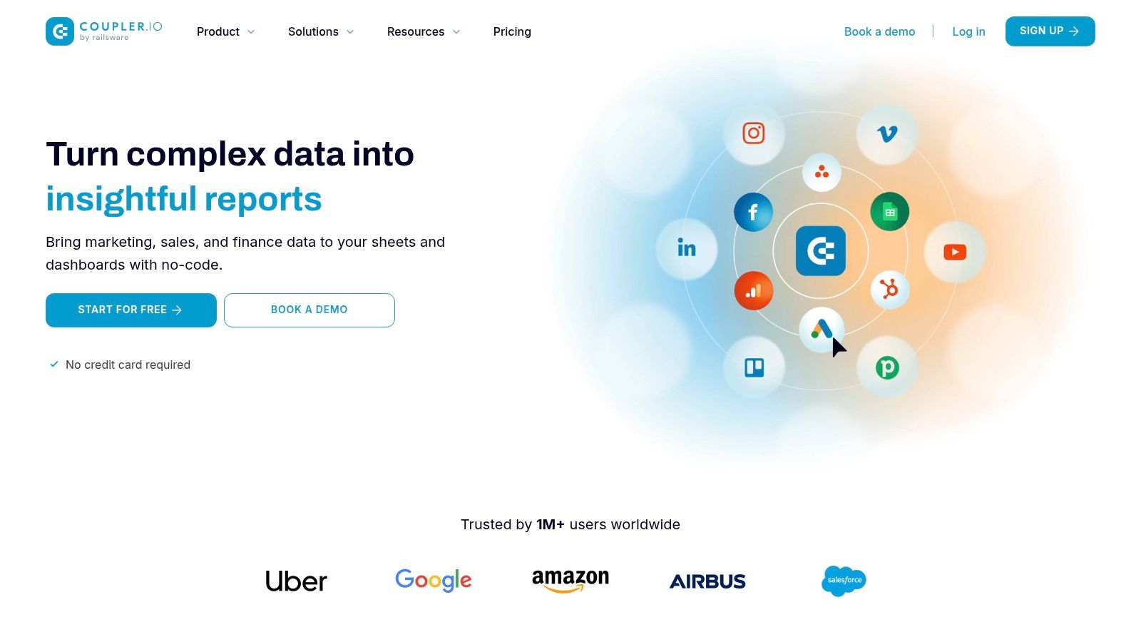
Unlike many platforms that focus solely on visualization, Coupler.io excels at the foundational step: data aggregation. It connects to over 70 sources, including marketing platforms like Google Ads, finance tools like QuickBooks, and project management apps like ClickUp. For instance, a marketing manager can automatically pull campaign data from Facebook Ads and Google Analytics directly into a Google Sheet, which then feeds a Looker Studio dashboard. This entire data pipeline can be scheduled to refresh as often as every 15 minutes.
The platform's user-friendly interface and highly-rated customer support make implementation straightforward. While it's primarily a data integration tool with limited native visualization, it shines when paired with BI tools. Its free plan offers a great starting point, with paid plans scaling based on data refresh frequency and run limits.
Key Features & Use Cases:
- Integrations: Connects with 70+ data sources like Airtable, HubSpot, and various APIs.
- Destinations: Pushes data to Google Sheets, Microsoft Excel, BigQuery, Looker Studio, and Power BI.
- Practical Use Case: An operations manager can consolidate project updates from ClickUp and budget data from an Airtable base into a single Excel report, scheduled for daily delivery to stakeholders. Another example is pulling Stripe transaction data into Google Sheets for custom financial analysis.
Pricing: Starts with a free plan; paid tiers begin at $49/month.
Website: https://www.coupler.io
3. Looker Studio
Looker Studio (formerly Google Data Studio) is a powerful, free data visualization and reporting platform that allows users to create interactive dashboards and beautiful, shareable reports. Its greatest strength is its deep, seamless integration with the Google ecosystem, making it a go-to choice for businesses heavily reliant on Google services like Analytics, Ads, and Sheets. This focus on visualization and real-time data connectivity establishes it as one of the best free report automation tools available.
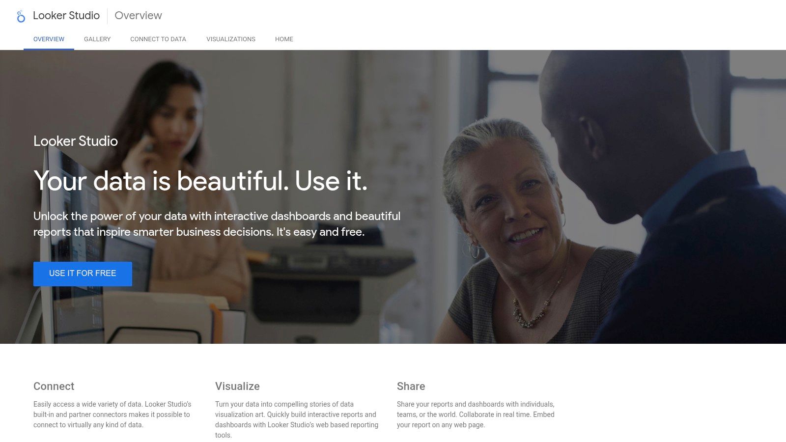
Unlike platforms focused on data extraction, Looker Studio excels at transforming raw data into compelling stories. Its intuitive drag-and-drop interface empowers non-technical users to build reports from scratch or use customizable templates. A digital marketing team, for example, can combine data from Google Analytics and Google Search Console into a single dashboard, enabling stakeholders to filter by date, device, or campaign in real-time. This eliminates the need for static, manually updated spreadsheets.
While its native connectors are strongest within the Google sphere, it can connect to other sources through third-party tools. However, users might notice performance lags when dealing with extremely large, complex datasets. For an in-depth look at leveraging Looker Studio for reporting automation, it is an essential tool to master.
Key Features & Use Cases:
- Integrations: Connects to over 800 data sources, with native support for Google Analytics, Ads, BigQuery, and Sheets. It can also connect to Airtable or an external API via community connectors.
- Customization: Offers a drag-and-drop report editor, interactive filters, and a library of customizable templates.
- Practical Use Case: An e-commerce manager can create a live sales dashboard that pulls inventory data from a Google Sheet and transaction data from Google Analytics, with scheduled PDF report delivery to the leadership team every Monday morning.
Pricing: Completely free to use with a Google account.
Website: https://lookerstudio.google.com
4. Tableau
Tableau is a market-leading business intelligence and data visualization platform that transforms raw data into understandable, interactive dashboards. While renowned for its powerful visualization capabilities, it also serves as a robust engine for creating automated reports. It excels at connecting to a vast array of data sources, from simple spreadsheets to complex databases like SQL Server and cloud services like AWS, allowing users to build and share dynamic reports that update in real-time or on a set schedule. This makes it one of the premier report automation tools for organizations focused on deep data exploration.
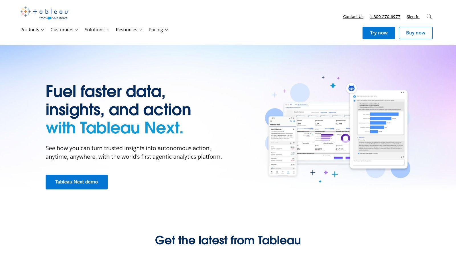
Unlike simpler tools, Tableau's strength lies in its analytical depth. Its drag-and-drop interface empowers users to create complex charts, maps, and graphs without coding. The platform’s AI-driven features, like "Ask Data," allow users to query their data using natural language, making sophisticated analysis more accessible. However, its power comes with a steeper learning curve for advanced functionalities and a higher price point compared to some competitors, making it a better fit for businesses with dedicated analytics needs.
Key Features & Use Cases:
- Integrations: Connects with hundreds of data sources, including Salesforce, SQL databases, and cloud platforms like Google BigQuery. It can also connect to no-code databases like Airtable.
- Analytics: Features advanced analytics like forecasting, clustering, and trend analysis directly within the dashboard.
- Practical Use Case: A retail operations manager can connect Tableau to their company's CRM and inventory database. They can then build an automated daily sales report that visualizes performance by region, forecasts product demand, and flags low-stock items, which is automatically refreshed and emailed to regional managers each morning.
Pricing: Creator licenses start at $75 per user/month, billed annually.
Website: https://www.tableau.com
5. Power BI
Microsoft Power BI is a dominant force in business analytics, offering a comprehensive suite of tools for creating interactive visualizations and in-depth reports. Its primary strength lies in its deep integration within the Microsoft ecosystem, making it a natural choice for organizations already using products like Azure, SQL Server, and Excel. It stands out by combining powerful data modeling and transformation capabilities with AI-driven insights, allowing users to build complex, automated reporting systems.
Power BI transforms raw data into compelling visual stories, moving far beyond static spreadsheets. Users can connect to hundreds of data sources, clean and model the data with its Power Query editor, and then publish reports that can be set to refresh automatically. This capability makes it one of the most robust report automation tools for creating real-time dashboards that monitor business health. While its extensive features can present a steep learning curve for absolute beginners, its free desktop version provides an excellent entry point for exploration and development.
Key Features & Use Cases:
- Integrations: Natively connects to a vast array of sources, including Excel, SQL Server, Azure, Salesforce, and many online services like Airtable or any generic API.
- Data Modeling: Utilizes Power Query for sophisticated data transformation, cleaning, and shaping before visualization.
- Practical Use Case: A finance team can connect directly to their SQL database and QuickBooks Online API, merging financial and sales data into a single, automated P&L dashboard that updates hourly for executive review.
Pricing: Power BI Desktop is free; Pro licenses start at $10 per user/month.
Website: https://powerbi.microsoft.com
6. Domo
Domo is an enterprise-grade, cloud-native business intelligence platform that combines data integration, visualization, and advanced analytics into a single, cohesive system. It’s engineered for scalability, making it a powerful choice for large organizations aiming to democratize data access and foster real-time decision-making. Unlike tools focused on a single part of the data pipeline, Domo provides an end-to-end solution, from connecting to hundreds of data sources to delivering interactive dashboards on any device.
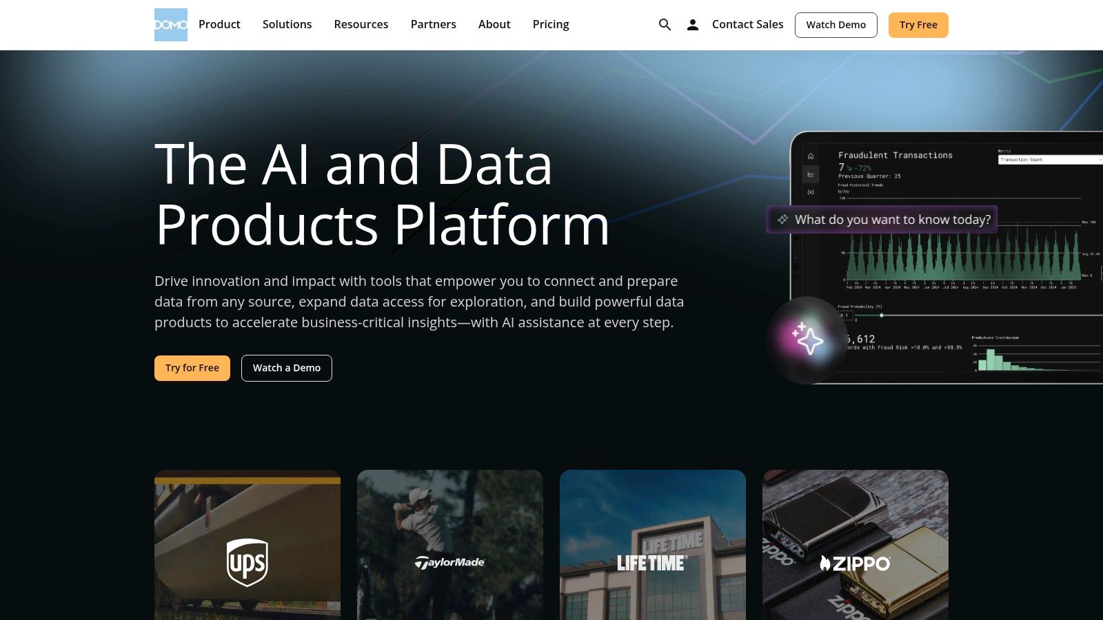
What sets Domo apart is its emphasis on collaboration and mobile-first accessibility. Teams can discuss data insights directly within dashboards, streamlining communication and accelerating action. The platform excels at handling massive datasets and complex queries, leveraging AI to surface predictive insights and anomalies automatically. For companies looking to embed analytics into their existing applications or portals, Domo's embed features provide a seamless way to deliver data experiences to customers and partners. This makes it one of the most comprehensive report automation tools for mature businesses seeking to enhance their process optimization techniques.
While its extensive capabilities come at a higher price point, the user-friendly interface and robust feature set justify the investment for organizations requiring a scalable, all-in-one BI solution.
Key Features & Use Cases:
- Integrations: Connects to over 1,000 data sources, including cloud apps like SmartSuite, on-premise databases, and files.
- Real-Time Dashboards: Customizable visualizations that update in real-time to reflect the latest business metrics.
- Practical Use Case: A retail chain's COO can monitor inventory levels from their warehouse management system, sales performance from their POS, and supply chain logistics from various partner APIs on a single mobile dashboard, receiving AI-driven alerts for potential stockouts.
Pricing: Pricing is customized based on usage and company size; contact sales for a quote.
Website: https://www.domo.com
7. Qlik Sense
Qlik Sense is a comprehensive data analytics platform that empowers users to create interactive, dynamic reports and dashboards. Its standout feature is the proprietary Associative Engine, which allows for free-form data exploration. Unlike query-based tools that provide linear, partial views of data, Qlik Sense reveals all relationships between data points, making it one of the most powerful report automation tools for uncovering hidden insights.
This platform excels at self-service analytics, enabling teams to build and customize their own reports without deep technical expertise. Its AI-driven features provide suggestions for visualizations and help identify key drivers in your data. While its capabilities are extensive, this power comes with a steeper learning curve compared to simpler tools. The platform is highly scalable and offers robust mobile access, making it suitable for enterprise-level deployments where deep data discovery is critical.
The main drawback can be the higher cost associated with its enterprise-level features. However, for organizations that need to go beyond basic reporting and truly explore complex datasets, Qlik Sense provides an unmatched level of flexibility and analytical depth.
Key Features & Use Cases:
- Integrations: Connects to a wide range of data sources including cloud databases, enterprise applications, and APIs.
- Associative Engine: Explore all possible data relationships across multiple sources without pre-aggregated data or predefined queries.
- Practical Use Case: A supply chain manager can integrate data from their ERP system, an Airtable base for inventory tracking, and logistics partner APIs. Using the Associative Engine, they can click on a delayed shipment and instantly see its impact on production schedules, inventory levels, and customer orders.
Pricing: Starts with a free trial; paid business plans begin at $30 per user/month.
Website: https://www.qlik.com/us/products/qlik-sense
8. Klipfolio
Klipfolio is a cloud-based business intelligence platform designed for creating and sharing real-time dashboards and reports. It excels at connecting to a multitude of data sources and transforming raw data into clear, actionable visualizations, making it a powerful choice for teams that need constant visibility into key performance indicators. Its focus on live data monitoring sets it apart from many other report automation tools that may rely on less frequent, scheduled updates.
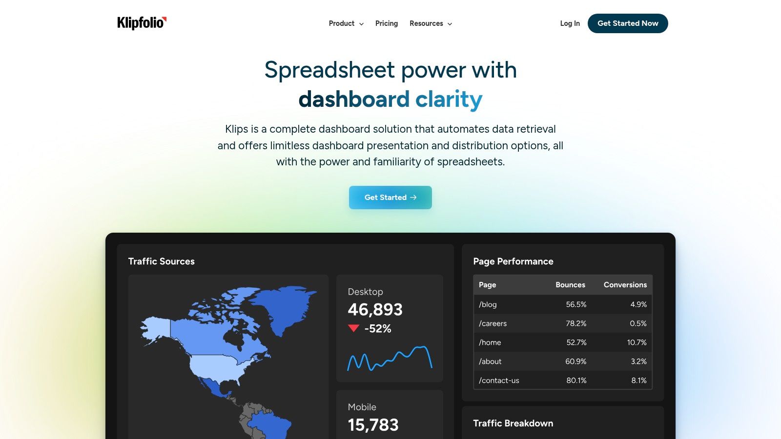
The platform offers a user-friendly experience with a gallery of pre-built templates for marketing, sales, and finance, allowing teams to get started quickly. For instance, a sales manager can connect their CRM and financial software to a pre-made dashboard that tracks revenue against targets, lead conversion rates, and pipeline health in real-time. The ability to define custom metrics and calculations directly within the tool empowers users to tailor analytics to their specific business logic without needing a data analyst.
While Klipfolio is strong in visualization and real-time monitoring, its advanced analytics capabilities are more limited compared to enterprise-level BI solutions. However, its affordability and wide range of integrations make it an excellent fit for small to medium-sized businesses looking to implement a dynamic reporting culture.
Key Features & Use Cases:
- Integrations: Connects with over 100 services including CRMs, databases, and marketing platforms. Also supports connections to custom APIs.
- Visualization: Offers pre-built templates, custom dashboards, and various chart types.
- Practical Use Case: A marketing team can build a live dashboard that pulls data from Google Analytics, Facebook Ads, and their email marketing platform (e.g., Mailchimp) to monitor campaign ROI and website traffic in one centralized view, with alerts for significant performance changes.
Pricing: Offers a free plan for single users; paid plans start at $125/month.
Website: https://www.klipfolio.com
9. Databox
Databox is a business analytics platform designed to centralize data from diverse sources into a single, cohesive view. It excels at creating real-time dashboards and automated reports, making it a powerful tool for executives, marketers, and sales teams who need instant access to key performance indicators (KPIs). Its core value lies in pulling live data from various services into one place, eliminating the need to log into multiple platforms to check performance.
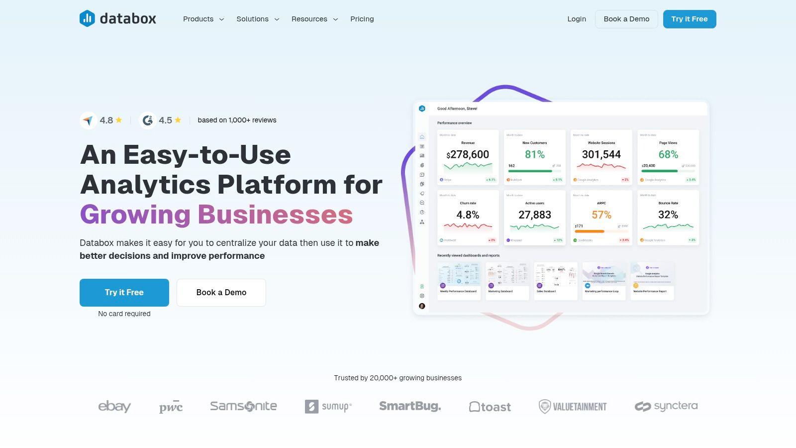
Unlike tools that focus solely on data integration, Databox is built for visualization and monitoring. It features a drag-and-drop dashboard builder and a no-code metric builder, allowing non-technical users to track custom metrics without developer help. For example, a marketing agency can create a dashboard that combines Google Analytics traffic, HubSpot lead conversions, and Facebook Ads spend, then schedule a daily performance summary to be sent directly to a client's Slack channel. Its mobile-friendly design ensures that critical data is always accessible.
The platform's broad integration support and goal-tracking features make it one of the most practical report automation tools for teams focused on performance. While some advanced integrations are locked behind higher-tier plans, its free plan provides significant value for small teams and startups.
Key Features & Use Cases:
- Integrations: Connects with over 70 platforms like HubSpot, Google Analytics, Salesforce, and social media channels. It can also connect to project management tools like ClickUp.
- Customization: Offers customizable, drag-and-drop dashboards and a no-code metric builder.
- Practical Use Case: A sales manager can set performance goals within Databox for their team's activities logged in a CRM. The system automatically tracks progress and sends alerts when a team member is falling behind or hits a new milestone.
Pricing: Offers a free-forever plan; paid tiers start at $47/month.
Website: https://databox.com
10. Swydo
Swydo is a highly specialized platform built from the ground up for marketing agencies and digital marketing teams. It excels at consolidating performance data from various advertising and analytics channels into professional, client-ready reports. Its primary function is to automate the entire reporting lifecycle, from data aggregation and visualization to branded delivery, making it one of the most efficient report automation tools for the marketing sector.
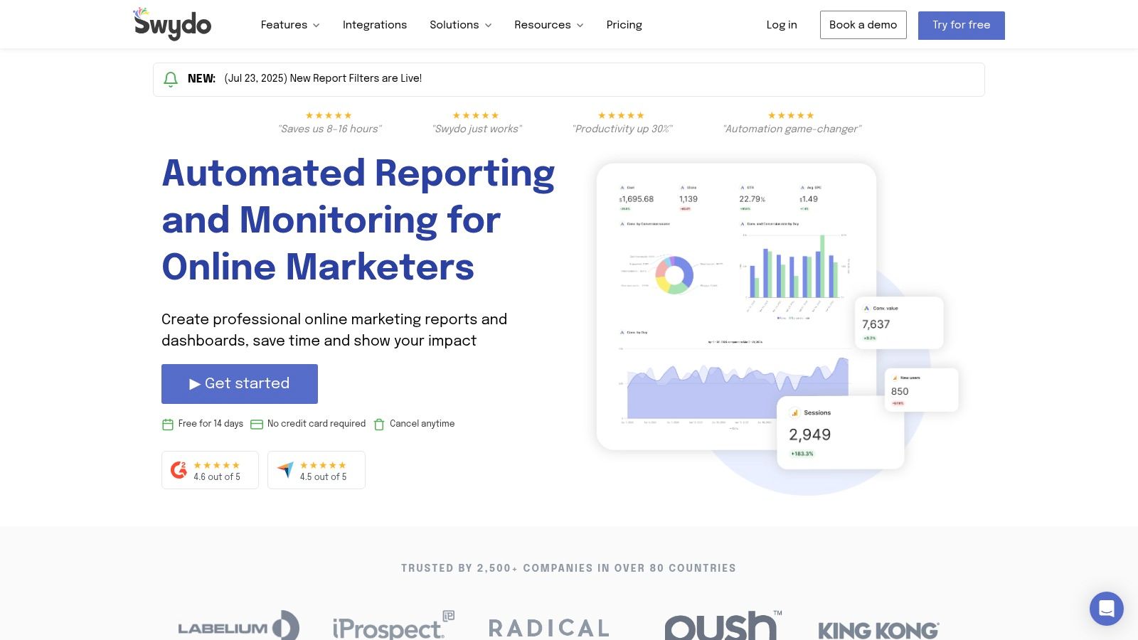
Unlike general-purpose BI tools, Swydo’s strength is its niche focus. It offers predefined widgets and customizable templates specifically for marketing KPIs, allowing an agency to quickly generate a monthly performance report combining Google Ads spend, Facebook Ads engagement, and Google Analytics traffic. The platform's white-labeling capabilities are a key differentiator, enabling agencies to apply their own branding and provide clients with a seamless, professional experience through a dedicated client portal.
The interface is praised for its user-friendliness, allowing for rapid report creation without a steep learning curve. While it's limited to marketing-centric data sources, its depth within that niche is significant. Pricing is scalable, typically based on the number of data sources connected, making it accessible for both small agencies and larger teams.
Key Features & Use Cases:
- Integrations: Connects directly with key marketing platforms like Google Ads, Facebook Ads, LinkedIn Ads, and Google Analytics.
- White-Labeling: Fully customize reports and dashboards with agency branding, logos, and color schemes for client presentations.
- Practical Use Case: A PPC specialist can create a unified dashboard for a client that pulls in campaign metrics from five different ad platforms. This report can be scheduled to automatically email the client a PDF version on the first of every month, saving hours of manual compilation.
Pricing: Starts at $49/month for 10 data sources.
Website: https://www.swydo.com
11. Whatagraph
Whatagraph is a marketing-focused reporting platform designed to help agencies and in-house teams automate the creation and delivery of visually appealing, client-ready reports. Its primary strength is in simplifying cross-channel marketing analytics, blending data from disparate sources into a single, cohesive narrative. This makes it one of the most effective report automation tools for demonstrating marketing ROI without needing complex data engineering or BI expertise.
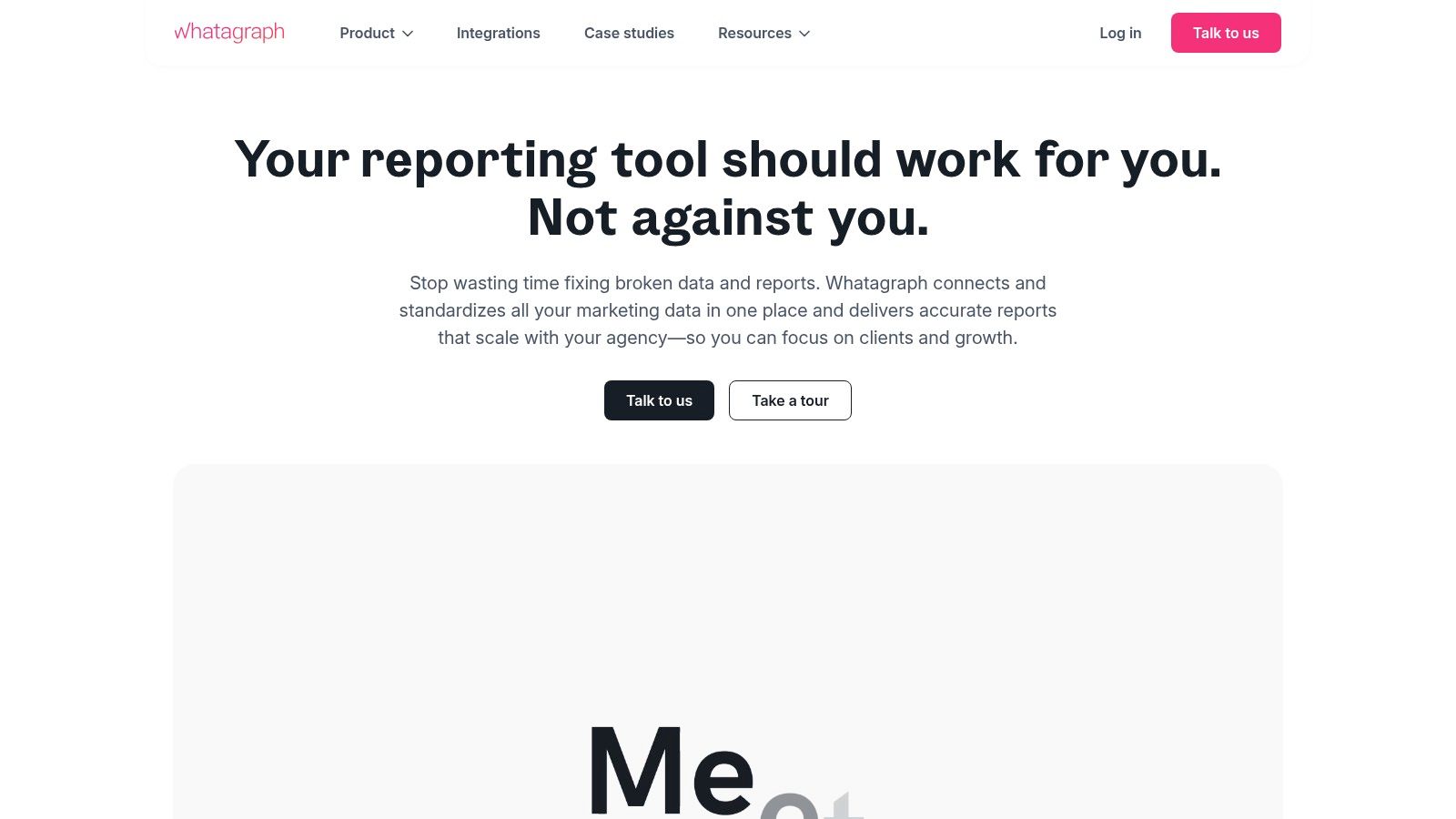
Unlike generic BI tools, Whatagraph is purpose-built for marketers. It offers pre-made templates and a drag-and-drop builder to create professional-looking dashboards that combine metrics from Google Ads, Facebook Ads, LinkedIn, and dozens of other marketing channels. A digital agency, for example, can create a white-labeled report for a client that automatically pulls in SEO performance from Ahrefs and social media engagement from Instagram, then schedules it for weekly email delivery, complete with custom branding and commentary.
The platform excels at making data presentation simple through customizable templates and a dedicated client portal for easy report access. While its specialization in marketing data means less flexibility for operational or financial reporting, its ease of use and powerful automation features for its core audience are significant advantages. Pricing is tiered based on the number of data sources and users.
Key Features & Use Cases:
- Integrations: Connects with 50+ key marketing sources like Google Analytics, various social media ad platforms, and SEO tools. It can also connect to a custom API for other data.
- Automation: Automates report generation and schedules delivery via email or a live link in a client portal.
- Practical Use Case: A marketing manager can build a comprehensive campaign performance report by blending cost data from Facebook Ads with conversion data from Google Analytics, providing a clear view of overall ROI in a single, automated dashboard.
Pricing: Starts at $223/month for the Professional plan.
Website: https://whatagraph.com
12. Funnel
Funnel is a powerful marketing data platform designed specifically for collecting, cleaning, and organizing advertising and marketing data. Its primary function is to eliminate the manual, time-consuming work of data wrangling, positioning it as one of the most specialized report automation tools for marketing teams. By automating the entire data collection and transformation process, Funnel ensures that data is always analysis-ready and reliable.
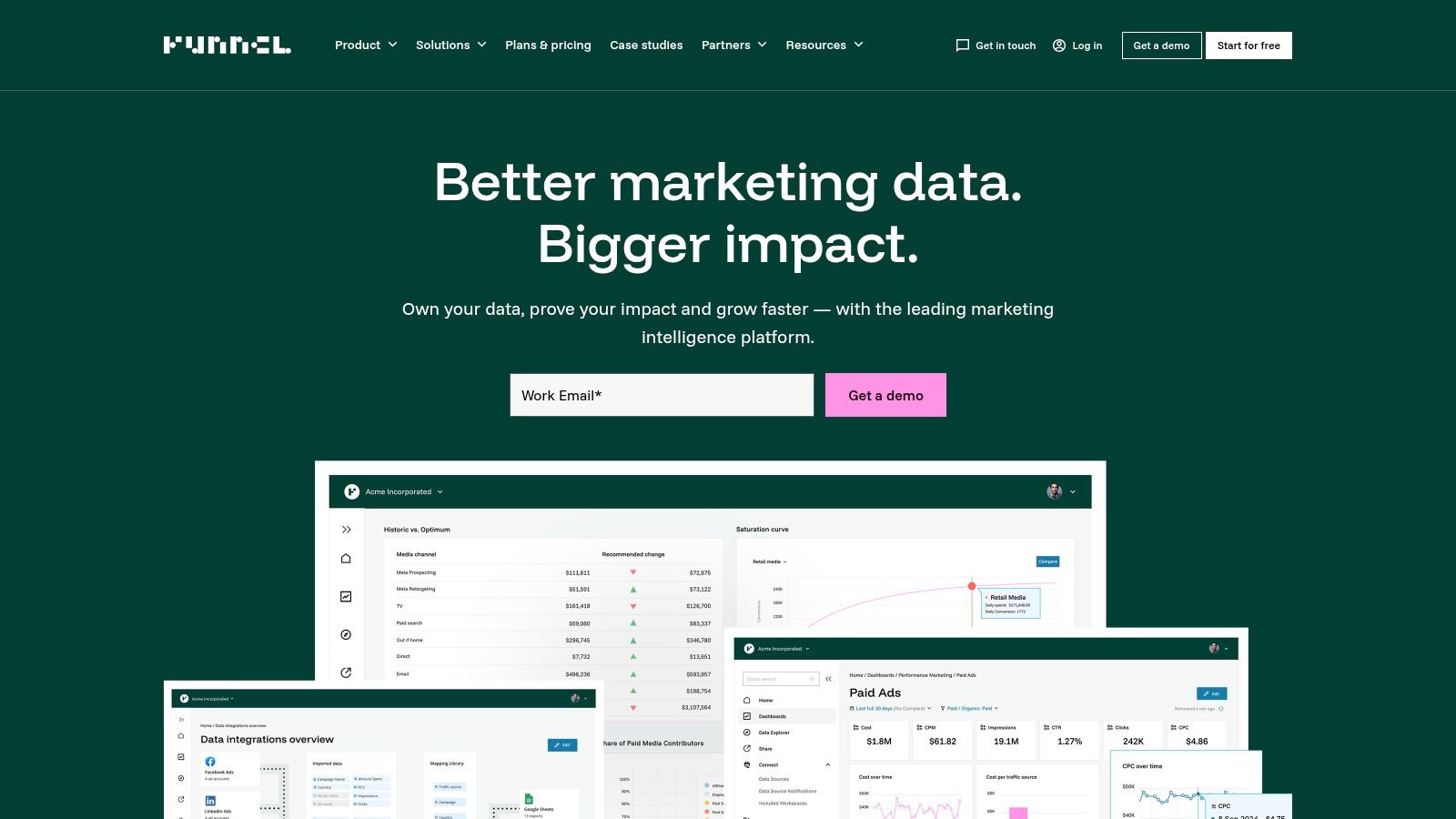
What sets Funnel apart is its massive library of over 500 marketing-centric connectors, covering everything from social media ads to CRM and e-commerce platforms. The platform excels at standardizing messy data, automatically grouping, cleansing, and mapping fields from different sources into a unified, coherent structure. For example, a performance marketing agency can pull data from Google Ads, Facebook Ads, and TikTok Ads, and Funnel will automatically normalize campaign names and metrics, making cross-channel analysis seamless.
While its focus on data transformation means it isn't a visualization tool itself, it prepares a high-quality data feed for any BI tool, data warehouse, or spreadsheet. Its reliability and extensive integration options make it a top choice for data-driven marketing organizations, though its advanced capabilities come at a higher price point compared to simpler integration tools.
Key Features & Use Cases:
- Integrations: Connects with 500+ marketing and sales sources like Salesforce, Shopify, and all major ad platforms.
- Destinations: Sends harmonized data to BI tools like Looker Studio, data warehouses like BigQuery, or even Google Sheets and Excel.
- Practical Use Case: An e-commerce brand can automatically consolidate ad spend data from 10 different channels with revenue data from Shopify, creating a unified dataset to calculate true Return on Ad Spend (ROAS) in real-time within their chosen BI tool.
Pricing: Custom pricing based on ad spend; starts with a free plan for limited usage.
Website: https://funnel.io
Report Automation Tools Feature Comparison
Choosing the Right Automation Tool for Your Workflow
Navigating the landscape of report automation tools can feel overwhelming, but the journey from manual data wrangling to streamlined, automated insights is a transformative one. As we've explored, the market offers a diverse range of solutions, from document-centric platforms like DocsAutomator, ideal for generating dynamic PDFs from data sources like Airtable, to comprehensive business intelligence powerhouses such as Tableau and Power BI, which excel at complex data visualization and dashboarding. Your ideal tool isn't necessarily the one with the most features; it's the one that aligns perfectly with your specific workflow, technical expertise, and business objectives.
The key takeaway is that there is no one-size-fits-all solution. A small business heavily reliant on Google Sheets and Airtable might find the lightweight, direct integration of a tool like Coupler.io or DocsAutomator to be the most efficient path to automation. In contrast, an enterprise-level marketing agency managing multiple ad accounts and client-facing dashboards would likely gravitate towards the robust, multi-channel capabilities of Funnel or Swydo. The decision ultimately hinges on a clear understanding of your own needs.
Key Factors in Your Decision-Making Process
Before committing to a platform, it's crucial to assess several factors to ensure a successful implementation and long-term value. Consider these critical questions:
- Primary Use Case: Are you generating static, formatted documents like invoices and certificates, or do you need interactive, real-time dashboards? Document generation tools and BI platforms solve fundamentally different problems.
- Data Sources and Integrations: Where does your data live? Ensure your chosen tool has native or API-based integrations with your core systems, whether that's a CRM, a project management tool like ClickUp, or a no-code database like Airtable or SmartSuite.
- Technical Skill Level: Be honest about your team's capabilities. Platforms like Looker Studio and Databox offer a lower barrier to entry, while Power BI and Tableau may require dedicated analysts or more extensive training to unlock their full potential.
- Scalability and Cost: Think about your future needs. A tool that's affordable today might become prohibitively expensive as your data volume or user count grows. Analyze the pricing tiers and understand the total cost of ownership.
Actionable Next Steps
To move forward, start by identifying a single, high-impact reporting process that is currently manual, repetitive, and time-consuming. This could be your monthly sales report, weekly project status updates, or client onboarding documentation. Use this specific use case as a benchmark to evaluate a shortlist of 2-3 tools from this article. Sign up for free trials and attempt to automate that one process. This hands-on experience will provide more clarity than any feature comparison chart ever could.
While many of the tools discussed focus on dashboarding, the need for generating tangible documents remains a critical business function. For a broader overview of tools that can help streamline document processes, including reports, consider exploring the best options in this guide to Top Document Automation Software.
Ultimately, investing in the right report automation tools is an investment in your team's most valuable asset: their time. By freeing your employees from the drudgery of manual report creation, you empower them to focus on strategic analysis, uncover deeper insights, and drive meaningful business growth.
Ready to stop manually creating documents and reports from your Airtable or other data sources? DocsAutomator specializes in just that, turning your data into polished, professional PDFs automatically. Start your free trial of DocsAutomator today and see how simple report automation can be.