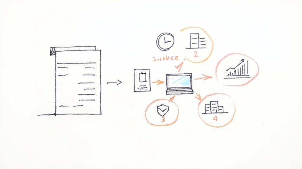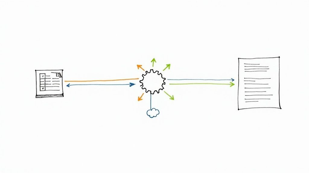
Automating your reports boils down to a pretty simple concept: connect your data sources, build a smart template that can pull in that data, and then tell a workflow tool to mash them together on a schedule.That's it. This one change can eliminate hours of mind-numbing manual work and finally deliver reports that are consistently accurate and on time.
Why Manual Reporting Wastes More Than Just Time
Are you still stuck in that weekly copy-paste marathon, just to get a report out the door? You’re not just burning hours; you’re basing critical business decisions on stale information and opening the door to costly mistakes. This isn't some minor annoyance—it's a serious operational drag holding your team back from high-impact work.
Think about a marketing manager manually piecing together campaign stats every Friday. They're pulling numbers from Google Analytics, hopping over to social media for engagement metrics, and then cross-referencing leads in a CRM like ClickUp. By the time that report is finally assembled, the data is already hours, if not days, old. This daily grind is a perfect example of the delays and inaccuracies that scream for a better way.
The True Cost of Manual Processes
The problem runs deeper than just wasted time. Manual reporting is a breeding ground for bad decisions. One tiny copy-paste error—a misplaced decimal or a skipped row—can throw off your entire analysis. Suddenly, you're doubling down on a failing ad campaign or completely missing a golden opportunity with a surge in customer interest.
When you have skilled people bogged down with repetitive data entry, their strategic value is completely wasted. Instead of analyzing trends or dreaming up the next big strategy, they're acting as highly-paid data clerks. That’s why learning how to automate report generation isn't just a tech upgrade; it's a strategic move to get your best minds back on what matters.
Automation as a Strategic Necessity
Automating reports isn't a "nice-to-have" anymore. For any business that wants to stay competitive, it’s a core function. By connecting something as simple as an Airtable base or a Google Sheet to a document generator, you can produce real-time reports at the click of a button. This isn't just about being faster; it's about being more agile.
The core idea is simple: connect your data, design a template, and let an automation tool do the repetitive work. This frees your team to focus on analysis and action, not data assembly.
Let's take a quick look at how these two approaches really stack up.
Manual vs Automated Reporting: A Quick Comparison
This table breaks down the fundamental differences between sticking with manual processes and making the switch to automation. It’s not just about speed; the impact touches everything from accuracy to team morale.
Seeing it laid out like this makes the choice pretty clear. Automation doesn't just do the same job faster—it produces a fundamentally better, more reliable outcome.
The shift to automation is happening everywhere. By 2024, around 60% of companies had already adopted some form of automation. What's more, marketing teams are using these tools 76% more than sales teams, showing just how critical real-time data is for customer-facing departments. This trend highlights a simple truth: automation boosts productivity and cuts costs.
This principle holds true across the board. To really appreciate the impact, it’s worth exploring the benefits of accounting process automation, which mirrors the advantages we see in reporting. Whether you're in finance or marketing, the mission is identical: swap out unreliable manual tasks for robust, automated systems that empower your team to do their best work.
Assembling Your No-Code Automation Toolkit

You don't need to be a developer to build a powerful automated reporting system. The secret is to assemble a "stack" of no-code tools, where each one handles a specific part of the process. I like to think of it as building with LEGOs—you just connect the right blocks to create exactly what you need.
This approach gives you incredible flexibility. You're not stuck with a one-size-fits-all solution; you're building a custom engine perfectly suited for your business's reporting needs. Your toolkit will come down to three core components, each playing a crucial role.
The Three Essential Components
To get your automated reporting off the ground, you need to combine tools from three main categories. Each one is a critical link in the chain, responsible for turning raw data into a polished, professional document that lands in the right hands.
Here’s the basic blueprint:
The Data Source: This is simply where your information lives. It could be a straightforward Google Sheet tracking expenses, a more complex Airtable base managing client projects, or even your customer database in a CRM like ClickUp. The only real requirement is that the data is structured and accessible.
The Automation Platform: This is the digital glue holding everything together. Tools like Zapier or Make act as the central nervous system for your workflow. They watch for triggers—like a new sale or a specific time of day—and shuttle data between your source and your document generator.
The Document Generator: This is where the magic really happens. A tool like DocsAutomator takes the data fed to it by the automation platform and uses it to populate a pre-designed template, churning out a perfect Google Doc or PDF every time.
The beauty of this modular setup is that you can mix and match tools based on what your business already uses. You’re never locked into a single, rigid system.
Real-World Toolkit Examples
Seeing how these pieces fit together in a real scenario makes the whole concept click. Your specific combination will naturally depend on your unique reporting needs and the software you already have in place.
Let’s say you’re an e-commerce store manager. Your stack might look something like this:
- Data Source: Shopify, where all your daily sales, customer orders, and inventory levels are tracked.
- Automation Platform: Zapier, set to trigger once a day on a schedule.
- Document Generator: DocsAutomator, tasked with creating a daily sales summary PDF.
On the other hand, a project manager at a creative agency would build a totally different stack:
- Data Source: A SmartSuite or ClickUp project board that tracks task statuses and team deadlines.
- Automation Platform: Make, which is great for pulling data from multiple projects at once.
- Document Generator: DocsAutomator, generating weekly, client-facing progress reports.
The real power here is adaptability. You can swap out any single component without having to tear down and rebuild the entire workflow. This gives you the freedom to build a system that perfectly fits how your team actually works.
Ultimately, the goal is a seamless flow of information. For anyone looking to go deeper, understanding the core principles of AI and automation in grant management shows just how valuable these skills are for non-technical users in any field. By selecting the right tools, you build a reliable engine that handles the reporting grind, freeing you up to focus on what really matters.
Connecting Your Data for Flawless Automation

Here’s where the magic really starts. Your entire automation lives or dies based on the quality of your data connection. I can't stress this enough: your automated report is only as good as the data you feed it. Think of it as the foundation of a house. If it’s shaky, everything you build on top will eventually come crashing down.
Don't worry, this part is less about being a technical wizard and more about being organized and methodical. Let's walk through a real-world scenario: connecting an Airtable base to generate a project management report. It’s a classic use case and a perfect way to get a feel for how to automate report generation.
Structuring Your Data in Airtable
Before you even think about connecting anything, your data needs to be in order. Trust me, inconsistent naming or messy fields will become your biggest headache, causing your workflow to fail again and again.
Let's say you're building a weekly status report for client projects. Inside your Airtable base, you need to have clean, distinct fields for everything that matters.
- Project Name: A simple single-line text field. No fluff.
- Client: This should be a linked record pointing to a separate 'Clients' table. It keeps things consistent.
- Status: A single-select field is perfect here. Use clear options like 'On Track,' 'At Risk,' or 'Completed.'
- Due Date: A dedicated date field.
- Project Manager: A collaborator field to assign ownership.
Consistency is absolutely non-negotiable. If one person enters "Completed" while another types "Done," your automation will get confused and likely fail. Standardizing your inputs from day one is the secret sauce behind effective https://www.docsautomator.co/blog/document-automation-software, because it guarantees predictable results.
Making the Connection with Zapier
With your Airtable base all cleaned up and structured, it's time to bring in the bridge: Zapier. You'll kick things off by choosing Airtable as your app and authenticating it with your API key, which you can easily grab from your Airtable account settings.
Pro Tip: Here’s a little trick I’ve learned that saves a ton of grief. Create a dedicated 'Reporting View' in your Airtable base. This is a game-changer. Filter this view to only show the records you actually want in the report—for instance, projects with a status of 'At Risk' or 'On Track'. Then, in your Zap, just tell it to pull data from that specific view.
This simple step prevents incomplete or irrelevant data from ever making it into your report. It’s a small bit of setup that dramatically cuts down on errors and makes your whole automation more reliable.
The demand for these kinds of integrated systems is exploding. The global industrial automation market, which powers the very systems we're talking about, hit a value of nearly $197 billion in 2024 and is still climbing. This growth is all about enabling the kind of real-time data integration and workflow optimization we're doing right now. By setting up a clean data connection, you're not just saving time; you're plugging into a massive global trend that's reshaping how business gets done.
Designing a Dynamic and Professional Report Template
An automated report is so much more than just raw data slapped onto a page. To be truly effective, it has to be clear, professional, and dead simple to read. This is where your template design makes all the difference.
We're going to walk through creating a polished template in Google Docs. The magic happens when your automation tool dynamically populates this template, turning a spreadsheet row into a client-ready document.
Let's imagine a common scenario: building a weekly social media report for multiple clients. The dream is to have one single template that works for every client, week after week, with zero manual edits.
Inserting Dynamic Placeholders
The real engine behind any dynamic template is its placeholders. Think of them as mail-merge fields that your automation tool looks for and replaces with live data. In a tool like DocsAutomator, these are wrapped in double curly braces, like {{placeholder_name}}.
To get started, just open a new Google Doc and sketch out the basic report structure. Then, start dropping in placeholders where you want your data to appear.
For our social media report, it might look something like this:
- Client:
{{client_name}} - Reporting Period:
{{start_date}}to{{end_date}} - Total Followers:
{{total_followers}} - New Followers This Week:
{{new_followers}}
These placeholders are direct commands for your automation. When the workflow runs, it will find the {{client_name}} placeholder and insert the value from the "client_name" field in your Airtable or Google Sheet. It’s a beautifully simple concept that's fundamental to learning how to automate report generation.
A well-designed template is the difference between a raw data dump and a professional, actionable report. Think of it as the friendly interface for your data—it makes complex information digestible for any stakeholder.
Using Tables and Conditional Logic
But what about data that isn't just a single number? Your social media report definitely needs to show the performance of recent posts. This is a perfect job for a table.
You can create a table in your Google Doc with headers like 'Post,' 'Reach,' and 'Engagement Rate.' Your automation tool can then be configured to dynamically add a new row for each post in your dataset, filling in the columns with the correct metrics.
Now for the really cool part: making your report smarter with conditional logic. This lets your template change its content based on the data it receives.
For example: You could set up a rule that says, IF engagement_rate > 3%, THEN show this message: "Outstanding engagement this week! Let's double down on this content style."
This little trick adds a layer of automated analysis, instantly highlighting wins or flagging issues without you having to lift a finger. It takes your report from a simple data-fill to a genuinely intelligent document that feels custom-built and insightful, saving you the time of adding that commentary yourself.
Putting Your First Automated Reporting Workflow Together
Alright, let's get our hands dirty. You’ve got your data sources prepped and a slick Google Docs template ready to go. Now for the fun part: connecting everything and building the engine that makes the magic happen. This is where we stop talking theory and start building a real, honest-to-goodness automated reporting workflow.
We'll stick with our project management report example. Using a tool like Zapier, I'll walk you through how all the pieces snap together—the trigger, the data lookup, the document generation with DocsAutomator, and the final delivery.
Kicking Off the Automation: The Trigger
Every automated workflow needs a starting pistol. In Zapier, they call this a Trigger. It’s simply the event that tells your workflow, "Okay, it's time to run." For recurring reports, a schedule is usually the most straightforward and reliable option.
For our project report, you have a couple of solid choices:
- A Simple Schedule: Using Zapier's built-in scheduler, you can set the workflow to run at a specific time. Think "Every Monday at 9 AM." This ensures your team and stakeholders get the report right on schedule for their weekly meetings. It's predictable and consistent.
- A Dynamic Event: You could also trigger the workflow whenever a new record appears in a specific "Ready for Reporting" view in your Airtable base. This approach is more reactive, generating a report the moment a project's data is finalized, rather than waiting for a batch.
Which one is right? It completely depends on how you work. Do you prefer reports batched on a regular schedule, or do you need them generated on the fly as projects hit key milestones?
To help you decide, here are some common triggers you can use to kickstart your automated report generation workflow, depending on your needs.
Key Automation Workflow Triggers
Choosing the right trigger is the foundation of a good workflow, so think about what event truly signals that a report is needed.
Finding the Data and Building the Document
Once your trigger fires, the action begins. The next piece you'll add to your workflow is an Action. At the core of any solid reporting workflow is effective data pipeline automation, which is just a fancy way of saying you're making sure information moves smoothly from point A to point B.
First, you'll set up an action to find the right project data in your Airtable base. Then, you bring in the star of the show: DocsAutomator. You’ll connect DocsAutomator to your Google Docs template and start mapping the fields. This is where you tell Zapier, "Hey, see that 'Project Name' field in Airtable? I want you to stick that right into the {{project_name}} spot in my Google Doc."
This mapping process is the heart of any automated document generation. It's the step that breathes life into your template, turning raw data into a polished, professional report.
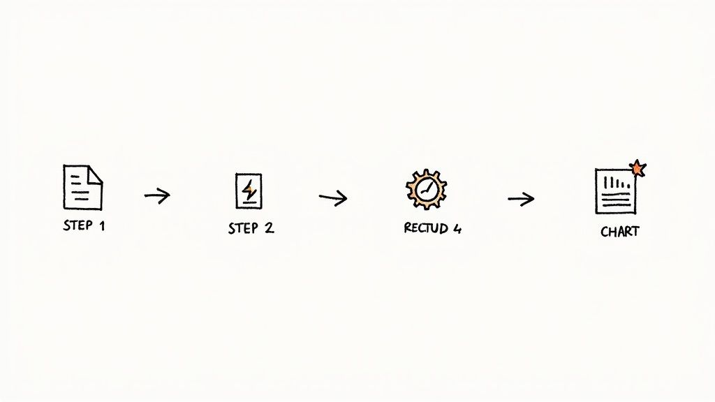
The real power here is in the sequence you build. A trigger kicks things off, an action grabs the correct data, and another action uses that data to populate your template. It's a simple, reliable chain of events you set up just once.
Getting the Report Where It Needs to Go
You've got a beautiful, data-filled report. Now what? The final step is delivering it to the right people without you having to lift a finger.
You'll add one last action step for delivery. You could have the finished PDF automatically attached to a Gmail message and sent to your stakeholders. Or maybe you want it posted directly into a specific Slack channel for the project team to see. This final step closes the loop, making the entire process truly hands-off.
The technology powering this, Robotic Process Automation (RPA), is seeing massive adoption for a reason. Valued at $22.8 billion in 2024, the global RPA market is expected to explode to over $211 billion by 2034. This growth shows just how vital this kind of automation is becoming for businesses that want to operate more efficiently and cut down on manual work. If you're curious, you can learn more about the rapid growth of RPA technology and see why it's changing how modern businesses operate.
Still Have Questions About Report Automation?

Jumping into automation for the first time usually brings up a few questions. That's perfectly normal. Getting clear, straightforward answers is the best way to move past any uncertainty and start building with confidence.
Let's walk through some of the most common things people ask when they're first learning how to automate report generation.
What Types of Reports Are Best for Automation?
The sweet spot for automation is any report that's predictable and driven by data. If you find yourself generating the same kind of report on a recurring schedule—daily, weekly, or monthly—and it always pulls information from consistent sources, it's a perfect candidate.
A few classic examples come to mind:
- Weekly sales performance summaries from your e-commerce platform API.
- Monthly marketing campaign analytics from a Google Sheet.
- Client activity logs for billing pulled from an Airtable base.
- Project status updates pulled from a tool like ClickUp or SmartSuite.
- Inspection reports generated from a form submitted in a Glide app.
On the other hand, reports that demand a heavy dose of unique, qualitative analysis each time are less suitable. If every report needs a brand-new interpretation or a creative spin, it’s probably best to keep a human in the loop for that final, crucial touch.
Do I Really Need Coding Skills to Automate Reports?
Absolutely not. That’s the entire point of the no-code tools we've been talking about. They’re designed to put the power of automation into everyone's hands, regardless of technical background. Platforms like Zapier, Make, and DocsAutomator all use visual, drag-and-drop interfaces.
You'll be connecting apps through simple menus and mapping data fields by clicking, not coding. As long as you have a basic understanding of how your data is structured, you’re good to go. You won't need to write a single line of code to build a powerful reporting workflow.
The most important skill isn't coding; it's clarity. If you can clearly define your process—what data you need, where it comes from, and what the final report should look like—you have everything you need to succeed with no-code automation.
Can I Automate Reports From Multiple Data Sources?
Yes, and honestly, this is where modern automation platforms truly shine. It's surprisingly easy to build a workflow that gathers information from several different places before creating a single, unified report.
For example, a typical workflow in Zapier could look like this:
- First, it pulls customer contact information from your Airtable CRM.
- Next, it grabs the latest financial figures from a Google Sheet.
- Finally, it combines all that data into one clean client summary report using DocsAutomator.
The trick is to just add multiple "action" steps to your workflow. You simply have it collect all the necessary data in sequence before it gets to the final "generate document" step.
How Much Does It Cost to Set Up an Automated Reporting System?
The cost is a lot more flexible than you might think, and it often pays for itself incredibly fast. Many of these tools offer generous free tiers that are perfect for getting started or for handling low-volume automations.
Once your reporting needs grow, you can look at paid plans. For tools like Zapier or DocsAutomator, these typically start around $20 to $50 per month each. When you stack that against the dozens of hours of mind-numbing manual work you're saving, the return on investment becomes obvious almost immediately.
For a closer look at the numbers, our guide on reporting automation breaks down the value proposition in more detail. It’s not just an expense; it’s a smart investment in efficiency.
Ready to stop the manual data-entry grind and start automating your documents? With DocsAutomator, you can turn data from Airtable, Glide, Zapier, and more into professional reports, invoices, and contracts in minutes. Build your first workflow for free and see how much time you can get back. Get started with DocsAutomator today.


